ERICOOL85
Shadow Treader
- Joined
- Jan 6, 2009
- Messages
- 865
- Reaction score
- 43
- Points
- 28
hey there guys its been a while since i have posted some of my stuff here
i hope you like it and that you leave nice comments hehe
thank you xoxo

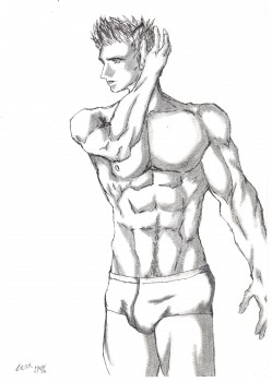
this one is supposed to be brent corrigan, but i dont think it looks much like him

i hope you like it and that you leave nice comments hehe
thank you
xoxo
this one is supposed to be brent corrigan, but i dont think it looks much like him
